Tesler's Law
Once upon a time, long before this new fangled ‘UX’ term, I was an enthusiastic student of Human-Computer Interaction and used to ‘enjoy’ reading articles from fine publications like the ACM Transactions on Computer-Human Interaction.
Just recently I had a flashback to those heady days when I rediscovered Tesler’s Law, also known as The Law of Conservation of Complexity.
This states that for any system with set capabilities, there is a set amount of complexity that can not be reduced. The only question remaining is working out how it is distributed.
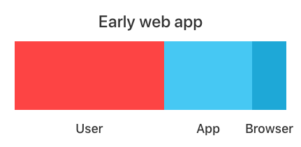
Take a look at this very simplified distribution of complexity for an old school web app (I’m thinking late 1990s here):

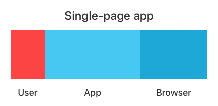
Compare that to a system that provides the same functionality, but using modern web tech:

According to Tesler’s Law, the overall width (complexity) of these two examples must be the same.
In the 90s example, browsers were not very capable, and application frameworks were just emerging, so product complexity was ladled onto the users’ plates. Think endless form-based entry and the difficulty around performing tasks requiring lots of data manipulation.
In the modern example, we’ve gone for a single page app. Assuming we’ve designed it well and done some usability studies, we can reduce the complexity for users. But Tesler’s Law states that this comes at the cost of adding complexity to the system.
Thankfully, browsers have come a long way, and we now have far more complexity taken on by browser vendors. Yay!
But the application layer also has to take some of the load. For example, we’ve chosen to use application and framework code to manage routing and history management. We can benefit from application frameworks taking on some of the complexity here, but we’ll also need to do more work ourselves to ensure that user tasks are as simple as possible. This means higher development and ongoing maintenance costs.
However, the big difference between the two examples is not in the relative size of components, but the flexibility we have to manipulate them.
In the early days of the web, we had limited scope to reduce user task complexity.
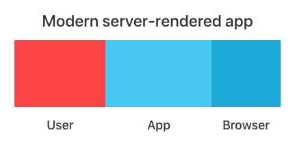
But now, we can opt to vary this how we like. We can decide to use less of what browsers have to offer. And we can reduce the complexity of our application code and the frameworks we use. This reduces development and maintenance costs at the expense of complicating the user experience.
Like this:

This seems like a useful way to think about trade-offs in web product development. We can also think about how complexity distribution is changed by the technology choices and application design approach we take.
Unfortunately, there’s a fly in the ointment which we’ll look at tomorrow.
All the best,
– Jim
