Edinburgh International Book Festival mobile site
Having seen my efforts at the Culture Hack Scotland event in May, I was approached by the nice people at the Edinburgh International Book Festival to create an official mobile application for the event, which took place last month.
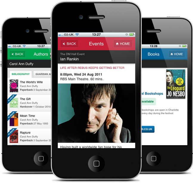
The final website can be seen at m.edbookfest.co.uk.
We decided that a mobile web site would serve the Book Festival’s needs better than would native applications. Here’s why we came to that decision, and how building an interactive and responsive mobile website need not be as huge a departure from traditional web development as you might think.
Why a mobile website?
In the very first meeting with Andrew Coulton from the festival, we discussed whether it would be better to develop native applications for specific smartphones, or to create a mobile web site. The goal of the app was to provide event listings, information about the authors appearing at the events, and the opportunity to purchase books and e-books through affiliate links to Amazon and iTunes.
The decision to develop a mobile website was influenced by a number of things, not least that my own background is in developing websites. This obvious bias aside, there were still plenty of compelling reasons to choose the web approach for the festival.
No app stores
Firstly, as an application for a specific event, there was a hard deadline of the start of the festival. The last thing we wanted was to have the launch delayed while awaiting approval from app stores. Website hosting and deployment (using Heroku) were entirely under our own control and publication was not subject to approval from a third party platform provider.
This meant that two or three releases were possible during the festival to fix some bugs, with a very quick turnaround that would not have been possible with native applications.
The problem of discoverability
Many mobile web applications can suffer from a lack of discoverability. Where app stores provide a single, searchable, centralised directory for native applications, there is no single directory for mobile web applications, although such things do exist.
However, this is really only a problem for applications that have a broad and varied target audience, such as games and to do lists (and yes, fart apps).
For a mobile website, it is largely up to the site provider to promote and market their own content through appropriate channels, as is the case for any website. For the Book Festival, we knew that we would have a ready-made engaged audience – the festival-goers themselves. We would also have some marketing channels to target this audience, including the physical festival site, the existing desktop website and the festival Twitter account, each which could publicise and link to the mobile site in its own way.
So, for a specific, targeted and already engaged audience, discoverability becomes far less of an issue. Both native and web applications would have to be promoted in channels targeted to your audience in similar ways, as no global app store is able to target niche users in this way. Discovering a niche application about a specific event through all the noise of highly popular games and gimmicks is not easy.
Interactive phone features
Some smartphone features can only be accessed via native APIs that are not as yet accessible to mobile web browsers, including cameras, microphones, telephony and so on. If you are creating an app that needs to access these features, then a native app is the way to go for now until broad browser support is available.
However, many content providers will simply not have any need to use these features. As part of our decision making process, we brainstormed a number of ideas for the application and found that there were none that could not be executed via existing browser technologies.
For example, one idea that did not make it to the final site was the ability to have an author ‘sign’ your smartphone and send the signature image to an email address. This is entirely possible using the HTML5 canvas element, a cross-platform JavaScript library for touch events, and some server-side code to handle sending the email. It is important to have an understanding of how each proposed feature would be supported, even if that feature doesn’t make the first cut of the application.
Device support
The native app approach requires that the developer either create custom apps for each target platform, or uses tools such as PhoneGap to build so-called ‘hybrid’ apps - essentially native applications developed using HTML, CSS, JavaScript and a toolkit that provides access to native APIs.
However, it is platform and the ubiquity of web browsers that makes the web universal, not the technologies that are used to build it. Hybrid apps are distributed and marketed just like other native apps, and so are not intrinsically cross-platform. There is also the chance that APIs will change or new devices will emerge, bringing further problems of interoperability.
Building a website using agreed web standards and with techniques such as progressive enhancement gives access, in principal, to anyone using a phone with a web browser. The devil here is in the details of browser support and designing a responsive interface to work across a broad spectrum of devices, screen dimensions, interaction capabilities and network performance. As for any website, the devices and browsers you develop for depends on the audience being targeted. Bryan Rieger provides an excellent dissection of the challenges of cross-device mobile web development.
In the case of the Edinburgh Book Festival site, statistics suggest that UK mobile internet use is dominated by the iPhone, iPad, Android devices and Blackberries, with around 5-6% remaining for other devices, even if other statistics suggest these devices do not have as high an overall penetration as you might expect.
Libraries and frameworks
The explosion of tools, libraries and frameworks for mobile web development in recent years means that it is easier than ever to get a head start in mobile web development and minimise time spent ensuring the site works across a wide range of devices.
It is increasingly the case that many of the modern smartphones are using similar browser technologies – the WebKit rendering engine powers Mobile Safari for iOS, the Android browser, and the Blackberry browser. An experimental WebKit-based browser is even shipped with the Amazon Kindle. Many libraries and frameworks are beginning to target WebKit alone, with some superficial support for other browsers.
However, the danger here is that, depending on your target audience, you lock out users of other browsers. Other browsers are popular in other audiences, not least Opera Mini. Again, this can be largely avoided by starting with a simple design, a fully operational website, and then layering on enhanced features progressively.
Design and development
Agile methods
Throughout the design and development of the site, I worked within two-week iteration cycles, with regular deployments to a staging environment, allowing frequent reviews by stakeholders at the festival. All code was written with a test-driven approach using tools such as Cucumber, Capybara, RSpec and Jasmine BDD.
All features were planned in advance using story cards that were agreed and prioritised. This allowed us to keep in touch with what exactly would be delivered in time for the start of the festival, given a fairly rigid budget and timescale. Inevitably not all the ideas could be implemented for this year’s festival, but with any luck we’ll be adding features in future years.
The overall effect of this was that I was able to spread the work of developing the site evenly over a period of 2-3 months, with 3 hours work a day in addition to my day-to-day work. Deployment had been continuous, so there were no nerves about the final deployment the night before the festival as there would have been with a Big Launch approach.
Design - keeping it simple
Time and time again during the design and development of the site I found myself up against the constraints of designing for mobile devices. Far from being restrictive, these challenging constraints can be the fuel for innovation and creativity. For example, limited screen real estate forces a focus on supporting the primary user task at hand and the continual stripping away of unnecessary fluff.
In native applications, this has resulted in some clever interactions that make the most of multi-touch, gestures and accelerometer motions to move features off screen but retain their availability. Some of these have become almost conventional, such as pulling the screen down to refresh a timeline feed.
I was initially tempted to introduce some touch interactions to the interface, but soon realised that this would have been a mistake.
Firstly, anything beyond the simplest touch interaction is complex to implement across different devices, and the JavaScript touch libraries that are available can be rather heavy. The interactions themselves are usually not as smooth as they are for native applications.
Secondly, I expected that few people would discover them – users are consciously using a mobile-optimised website and not a native application, so it is unlikely that they would expect complex touch gestures.
Instead I aimed to create a design that would be as responsive and simple as possible based on simple single touch interactions. The key here was fast page transitions and optimised performance.
Framework choice
The mobile web development landscape is now well populated with JavaScript frameworks that allow for rapid development of single-page, touch-optimised web applications. I have spent some time experimenting with these, including jQuery Mobile, jqTouch and Sencha Touch.
To my mind, all three frameworks are attempting to ape the native experience too closely – and not always successfully – with some jerky animations, mis-positioned elements and some performance issues. We didn’t want to create a native app experience, but a simple mobile-optimised website with a responsive feel.
I decided therefore to develop the site without the aid of an all-encompassing framework, but instead layer on richer functionality for more capable devices as and when it was appropriate. There are now a number of small, modular JavaScript libraries that aim to fill specific needs for mobile devices that can be cherry-picked as needed. Two such examples are Zepto.js and XUI.
A website is a website is a website
We were making a mobile optimised website, so we decided it should behave much like a website, and work within the confines of a mobile web browser. The back button should work, links should behave like links and most importantly, it should continue to provide a web experience for phones without touch interactions.
At the same time, we wanted smartphones with fast JavaScript engines to enjoy a ‘single-page’ experience with Ajax loading of content to improve perceived performance. This is a classic use-case for progressive enhancement. All the links in the website point to full URLs, and so work fine without JavaScript enabled. However, for smartphones, link activations are intercepted using JavaScript and the target content is loaded with Ajax and injected into the existing page. This means that only body content is loaded and re-drawn for each page, giving the site a more responsive app-like feel.
However, the browser address bar is still updated as the user navigates around, allowing for favourites to be set, deep links to be emailed, tweeted and bookmarked. A simple but effective example of the importance of this was demonstrating during the festival by the use of deep links in tweets from the official Book Festival twitter account to link to specific day listings and events. Another feature that was explored but not implemented was the use of QR codes around the physical festival site to allow deep linking into specific event, author or book pages.
The ‘single-page’ style of navigation was achieved using a simple combination of the Zepto.js mobile-optimised JavaScript library and a modified version of Pjax - another small library that uses the HTML5 history API and Ajax to load and inject content. The back-end Ruby on Rails application is modified to respond with only the page body content when a Pjax request is made, but with the full HTML document for all other requests.
Boilerplates
Another tool that I found useful to kick start the development process was HTML5 Mobile Boilerplate. Based on the HTML5 Boilerplate, it provides HTML, CSS and JavaScript starting files with commonly used code and conventions specific to mobile-optimised sites. The golden rule is to critically evaluate everything that is provided, understand what it is for, decide whether it is necessary in the context of your own project and remove it if it is not relevant.
For example, in the case of the Book Festival site, I eventually removed the reference to Modernizr, which detects browser features and allows the developer to progressively enhance based on support for specific browser capabilities. I just wasn’t using it for anything important, and so the bandwidth savings gained from removing it trumped any minor issues that it might have helped fix.
Open source FTW
As part of the project, all source code has been released under a GNU General Public License on Github. Feel free to fork it and play around. The Book Festival are planning on opening up listings data in the future, but access can currently be requested on a case-by-case basis. See the README on Github for more information.
Thank you
This project would not have been possible without the support of the Edinburgh Festivals Innovation Lab, and in particular I would like to thank Rohan Gunatillake and Ben Werdmuller for organising Culture Hack Scotland and providing excellent motivational impetus. One of the goals of the hack day was to foster co-operation and partnerships between the cultural sector and independent developers, and I’m very glad to have been part of an example of that working successfully and producing something with a far wider output that just a fun hack.
Secondly thanks to everyone at the Edinburgh International Book Festival, and in particular Andrew Coulton, who despite being phenomenally busy in the run-up to the festival found time to provide detailed and helpful feedback and support.